The colour, dark-mode, and font system behind this site — and how to play with it
Switching the Lights
Most personal websites pick a colour scheme and stick with it. I couldn’t decide — so I built a system instead. This site has five named palettes, a light/dark mode toggle, four reading fonts, and keyboard shortcuts to switch them all without reloading. Everything changes at runtime via CSS custom properties.
How to use it
Press p on any page (when not typing in a form field) to cycle through the five palettes. Press d to toggle dark mode. Press f to cycle through the reading fonts. A small toast notification appears bottom-right with the name. Your choices are remembered in the browser between visits.
Dark mode — press d, use the dark-mode button (☾) in the navigation bar, or click below. The site also respects your OS preference automatically.
Fonts — press f, or use the Aa button in the navigation bar, to move through four typographic settings: the default (Lato + Volkhov), Lora, Inter with Playfair Display headings, and Source Serif 4 with Outfit headings. This whole page re-sets in the chosen font instantly.
Click to switch palette:
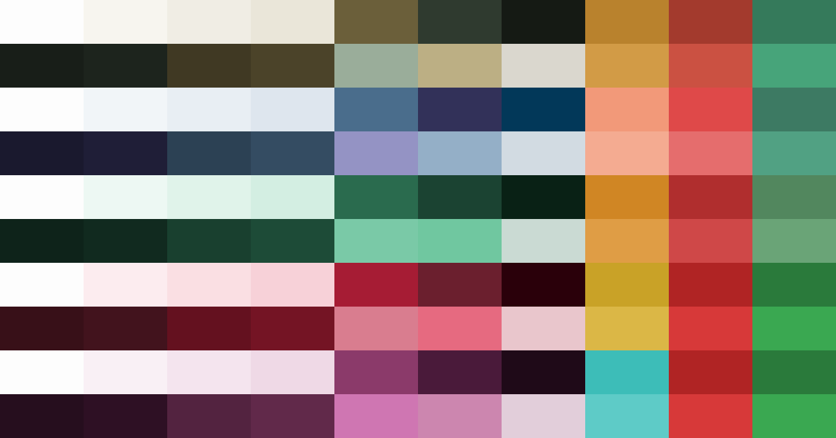
Colour maps
Each palette is shown as two ten-colour strips — light and dark mode. They are meant to be read as overall colour moods rather than as labelled implementation tokens.
Colour palettes
H · Fieldnote is the default: carbon olive primary, olive-brass secondary, ochre accent. It reads more like an archival field notebook or museum label than a digital product skin. It is warmer than Moonlight, less green than Verdant, and deliberately restrained for long academic pages.
D · Moonlight is the cool editorial option. Blue-family link colours sit naturally inside dense academic citations. The orange accent adds warmth without clashing with the scientific domain. In dark mode the purple-navy backgrounds read as midnight sky — visible colour without eye-strain.
E · Verdant — deep forest green primary, amber accent. Works particularly well in dark mode where the greens deepen toward something close to a terminal aesthetic. The light surfaces pick up a faint green tint that reads biophilic rather than clinical.
F · Claret — deep wine primary, crimson secondary (7.2:1 contrast against white — the highest contrast in the set), gold accent. Most dramatic in dark mode: the surface stack from near-black to deep red-dark gives the impression of coals. The gold accent against these surfaces is the most striking colour combination in the set.
G · Meridian — deep plum primary, mauve secondary, vivid teal accent. A split-complementary pairing (plum ↔ teal, around 180 degrees apart via the split). Unusual and striking, but mauve link colours inside dense research text felt a step too far from academic convention. Demoted from default to Easter egg.
Reading fonts
Beyond colour, the same runtime approach drives four reading fonts, cycled with f or the Aa button. Each one re-points two CSS variables — --font-body and --font-heading — and the page re-flows in the new type immediately:
- Default — Lato for text, Volkhov for headings: the site’s clean, neutral baseline.
- Lora — one warm editorial serif for both text and headings; the most book-like option.
- Inter + Playfair Display — a crisp modern sans for reading under a high-contrast display serif for headings.
- Source Serif 4 + Outfit — a comfortable text serif beneath a geometric sans heading; an academic-journal feel.
All the alternatives are self-hosted (no third-party font requests), the choice is remembered between visits, and — as with the palette — an anti-FOUC snippet applies it before the first paint so there’s no flash of the wrong font. Try pressing f a few times as you read this.
How it works
The site is built on Jekyll with a custom colour architecture on top of the Feeling Responsive theme. At build time, a Sass variable ($color-scheme: H) selects the active Fieldnote palette. All derived values — surface tints, muted text, border shades — are computed with scale-color() and mix() and exported as static CSS custom properties on :root and html[data-theme="dark"].
At runtime, pressing p writes data-palette="X" on the <html> element. The stylesheet carries pre-compiled variable overrides for each palette under html[data-palette="X"] — specificity (0,1,1) beats :root (0,1,0), so the switch is instant with no fetch, no rebuild, and no flash. An anti-FOUC snippet in <head> reads localStorage before the first paint so your saved palette applies before any content renders.
The colormaps above are deliberately minimal: ten swatches for light mode and ten for dark mode, enough to show the character of each palette without turning the page into a table of hex values. Fieldnote is what first-time visitors see and what I consider the canonical look of the site. Everything else is optional. If you are reading this in Claret dark mode, those deep red surfaces are doing exactly what I intended.